

Request: banner remodeling
I think I've hunted down most of the bugs I've come across and shared the areas that were the most confusing to me.
Sorry for the flood of messages! I know it's a lot, but I also know this community exists to help improve the product, so I hope this feedback is useful.
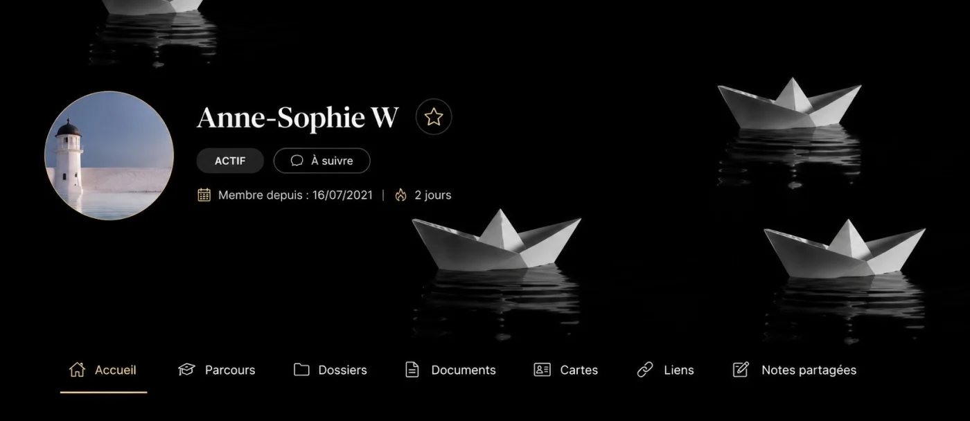
While I'm at it, I'd also like to make a small design suggestion. Although I appreciate that the banner colors are customizable, I'd much rather be able to upload my own banner for the entire Vault—or even let clients choose their own, similar to how FC does it.
I also find the dashboard blocks a bit unnecessary. Some of the same information appears both inside the banner and below it, and for Vaults with only a handful of files, the result is mostly a series of blocks displaying "0" or "1" items. Personally, I think a cleaner interface would make the experience feel more polished.
Of course, that's just my opinion, and I completely understand if this isn't an area you want to prioritize. I just think thoughtful aesthetics can make a product significantly more enjoyable to use for both the clients and Admin.
Thanks again for your tremendous work!
NB) an AI generated example with a banner I would have chosen. Of course some elements such as the date are missing (it’s very hard to make do a specific illustration to AI as it tends to hallucinate and ignore your previous input). Notice that it made the banner larger, which I personally find very good looking.
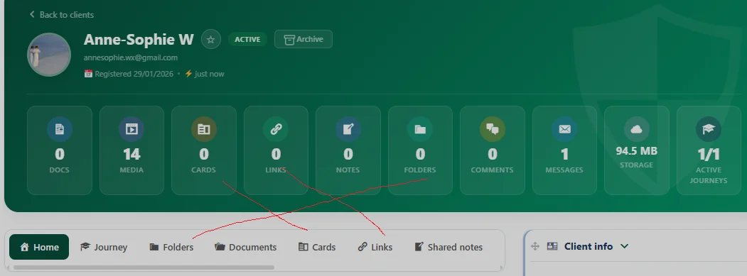

Thank you for your feedback.
It's difficult to find the best compromise between which information to display and which to hide, as everyone's usage is different. That's why clients can customize their menu displays and choose which items are shown or hidden.
The administrator can also do this for all clients or for a single client. This allows for greater flexibility for everyone without disrupting the user experience.
Regarding the photo, it's a feature request. I encourage you to add it to the roadmap. This is where feature requests and general progress tracking are centralized.
Anne sophie No update is more important than another. They're all important as long as they bring benefits and convenience for everyone. Thanks again for your feedback. Surprise in the next update ;)
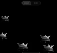
Dragan Stamenkovic amazing :)
Anne sophie The latest updates have given us complete control over the design. I think that's what you wanted 😀
Dragan Stamenkovic it looks great!! Oh, on that: I’ve noticed that the plugins in the spaces are white. Would it be feasible to adapt their background to the theme color of one’s community, whether light and dark? That would be the cherry on the top for me!
Edit: come to think of it, perhaps the background of the vault itself could be of the same colour as the community background, so the vault looks completely integrated, like a part of it, just like addons like fluentbooking are? Does it make sense?